Overview
In my time at Vizibl I focussed on the whole Product Design process from user journeys, wire-framing, mock-ups, full user interface designs, prototypes and design handoff to the developers.
I have also built out an entire design system of components in Sketch to make designing new features even quicker.
In addition to this I rebranded the company’s website and built it too.
Project List
‘Projects’ are a big part of the Vizibl Platform. Our customers have many suppliers and use Projects to manage their different suppliers and any initiatives they may have with them.
A big feature I worked on at Vizibl was to revamp the Project list to meet a few requirements our users had. The main goal was to show more results on the screen at once in the search results for Projects.
Secondly I looked into how we could display important information upon an intial glance and expanded the level of information that appeared when hovering over each column.
Finally, given a lot of users need to check and update Projects on a daily basis, we wanted to allow them to take certain actions from this view without having to go in and out of each Projects page, such as changing the stage and status of the Project, as well as adding an event to the Roadmap.
Hover cards
To showcase more information to users and allow them to take actions without entering the Project I designed a hover card for each column.
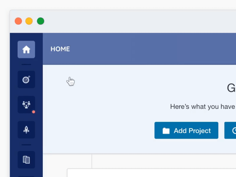
Nav menu
One of the first projects I worked on at Vizibl was to update the navigation of the platform.
To help clean up an ever growing list of links I looked into how we could group some links in the side nav and place them into the top nav, when that particular side nav section is active.
In the example shown, Projects, Check-Ins, Events, Tasks and Surveys were all grouped under “Engage” in the side nav meaning their links now appear along the top when Engage is active.
Modals
Modals are part of almost every platform and are used throughout for various reasons, from simple messages, to confirmation modals to more complex create modals. The Modals at Vizibl when I joined felt very dated and the content within didnt utilise space very well.
As part of the design system I’ve been building at Vizibl I wanted to address Modals and create a new global componenet for them. When joining Vizibl we had multiple sets of Modals, such as small popups to larger complex modals and similar modals for the same purpose that were all different in design.
For the new version I wanted all Modal types to live under one single consistent Modal. I approached the new design with this idea in mind and created a modal that would adapt based on the height of the users browser window and also the amount of content within.
Then within the Modals I updated the design of all components to follow a certain set of rules so that they can all be slotted into various modals in different orders and all work well together.
With all these changes made creating new modals and maintaining/updating existing ones became extremely fast for the development team.
The basic rules I set were as follows:
• If scroll required adapt css of header and footer sections to change background colour so content within can scroll.
• All Modals have the same set width (shrinking responsively when required)
• All modals have an icon to help display what type the modal is. e.g. red for confirmation dangers.
• All modals content uses the designed components within.
Dev handover
This is the handover doc I prepared for the developers describing how the new modal should work responsively etc.


